
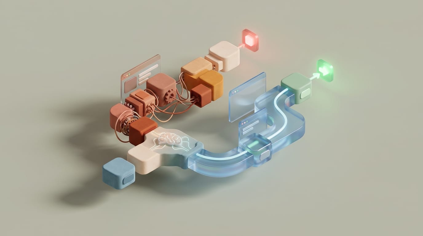
Technical performance metrics often fail to capture the real user experience because the human brain interprets latency through psychological filters rather than raw milliseconds. Applying perceived performance ux principles allows engineers to bridge the gap between backend limits and user expectations by managing the operator’s subjective clock. When a system feels instant, users enter a state of flow regardless of whether the actual data fetch took 100 or 500 milliseconds.
High-scale engineering often focuses on Time to First Byte (TTFB) or Largest Contentful Paint (LCP). While these help search rankings and accessibility, they do not account for the emotional response a user has when a button press leads to a blank screen. By focusing on the psychology of waiting, designers can create systems that reduce anxiety and maintain engagement during unavoidable processing delays.
Understanding this system requires looking past the network tab into the neurobiology of how humans perceive time. A user’s internal clock is a variable biological process influenced by visual feedback, cognitive load, and interface color. This means developers can influence how fast an app feels without necessarily changing the server response time.
The Disconnect Between Technical Latency and Human Perception
Actual performance is the objective speed of a system; it measures how long it takes for a server to respond or a script to run. Perceived performance is a measure of how fast a user thinks the system is. Research suggests that users perceive 100 milliseconds as instantaneous, while anything beyond 300 milliseconds creates a noticeable lag. By one second, the user’s sense of smooth interaction begins to break.
The goal of perceived performance ux is to ensure visual feedback begins within that initial 100-millisecond window, even if the total execution time is much longer. If the system does not acknowledge the user’s intent immediately, the brain perceives the idle time as a system failure. This is why edge computing reduces feedback loops by moving the initial response closer to the user while the heavy processing happens elsewhere.
When a user experiences an uncommunicated delay, the brain’s “active waiting” state triggers a minor stress response. This physiological stress speeds up the internal clock, making a short wait feel significantly longer. Conversely, when a user sees progress or interacts with a visual task, they enter a state of “passive waiting” where time seems to move faster. Raw speed matters less than acknowledgment because providing immediate visual confirmation halts the “is it broken?” anxiety loop.
Visual Strategies to Mitigate Wait State Anxiety
Loading spinners are relics of early web design that can increase perceived wait times. A spinner forces the eye to track a circular motion, which keeps the user’s focus entirely on the fact that they are waiting. Skeleton screens offer a better alternative by signaling layout stability from the first frame. These blank versions of the final layout gradually fill with content, providing a visual roadmap that allows the brain to begin reading the page structure before the data arrives.
This technique creates a sense of forward momentum in high-load environments. While engineers might use sub-second indexing algorithms to speed up the backend, the interface still needs to render results in a way that feels productive. Showing where text and images will soon appear satisfies the brain’s need for immediate context.
When a task takes longer than five seconds, simple loading states are no longer enough. Determinate progress bars that move at variable speeds (starting fast and slowing down toward the end) feel faster than those moving at a constant rate. This accelerated start provides an immediate hit of progress. Users also prefer linear bars over circular loops for long tasks because a linear bar provides a visual finish line, reducing the mental effort needed to estimate the remaining time.
Optimistic UI and Perceived Performance UX Architecture
Optimistic UI is an architectural pattern where the application assumes a server request will succeed and updates the interface immediately. If a user likes a post, the icon changes color and the counter increases before the API call even leaves the browser. This creates an illusion of zero latency that is essential for modern collaborative tools. This design philosophy relies on offline-first application design, making the local device the primary source of truth for the user’s actions.
This approach requires a reliable state management system to handle potential errors. If a server request fails, the UI must gracefully roll back the state and inform the user. However, since most typical user actions succeed, the risk of a rare rollback is worth the benefit of an interface that feels as fast as a local app. Successful systems maintain the optimistic state but add a “failed” indicator rather than making the data disappear, which keeps the user’s workflow intact.
By separating visual confirmation from network confirmation, software stays out of the way of productivity. Users can move to the next task while the system handles reconciliation in the background. This ensures the application feels responsive regardless of fluctuating network conditions.
The Relaxation Paradox and Biological Time Dilation
Specific wavelengths of light can physically alter a user’s autonomic nervous system, a phenomenon known as the Relaxation Paradox. Blue color palettes have been shown to lower heart rates and reduce stress levels during digital interactions. When a user is calm, their perception of time dilates, making a three-second wait feel much shorter.
Many banking and enterprise platforms use deep blue tones to slow down the user’s internal clock during high-stakes or high-latency interactions. Beyond color, the direction of motion influences speed perception. Human vision is biologically optimized for horizontal tracking. Progress indicators with horizontal pulses are perceived as moving faster than circular ones because circular motion feels “stuck,” while horizontal motion signals traversal from one point to another.
Combining a cooling color scheme with subtle horizontal animations uses biological loopholes to manage perceived performance ux. This multi-sensory approach calms the user’s heart rate while providing visual stimuli that the brain decodes as fast progress. These small design choices can make a sluggish legacy backend feel like a modern, responsive application.
Reducing Cognitive Load Through Workflow Design
Speed is not just about loading data; it is about the speed of decision-making. Hick’s Law states that the time it takes to make a decision increases with the number of choices available. An app with a fast backend can still feel slow if the user must hunt through nested menus to perform basic tasks. This friction increases cognitive load, which the brain interprets as latency. Ensuring common actions are only one or two taps away makes the system feel fluid.
When the interface anticipates the user’s next move, the software seems to move at the speed of thought. However, adding too many features can lead to a state where complexity can lead to productivity loss. The cognitive overhead of learning a tool often masks any technical performance gains made at the server level.
For complex processes like data-heavy onboarding, sorting information into smaller, digestible steps improves perceived speed. Even if the total number of fields remains the same, completing several small steps feels faster than completing one long page. Each completion provides a small dopamine hit that resets the user’s tolerance for the next phase. This modular approach reduces mental fatigue and ensures the user’s mental model of the app remains light and responsive.
Measuring the Efficacy of Perceived Speed
Standard monitoring tools cannot measure perceived performance ux effectively. Validating these improvements requires qualitative testing, such as subjective time estimation. In these tests, users perform a task and then estimate how long it took. If a task took five seconds but users estimate it at three, the visual strategy is working. A/B testing different loading paradigms while holding server response times constant can also reveal which visual cues most effectively reduce bounce rates.
Ultimately, user retention is the most important metric. Users do not leave because a site is technically slow; they leave because they feel frustrated. Metrics like Interaction to Next Paint (INP) provide a bridge by measuring the time until the browser renders the next frame, but the psychological feel of that frame dictates long-term loyalty.
Aligning a technical roadmap with perceived performance goals creates a product that respects the user’s biology. As applications become more complex, mastering these psychological patterns ensures software feels instant regardless of network conditions. By treating the user’s brain as a critical part of the technical stack, developers can eliminate the anxiety of digital waiting states and build more natural, responsive tools.